
Moonstruck
Chocolate Co.
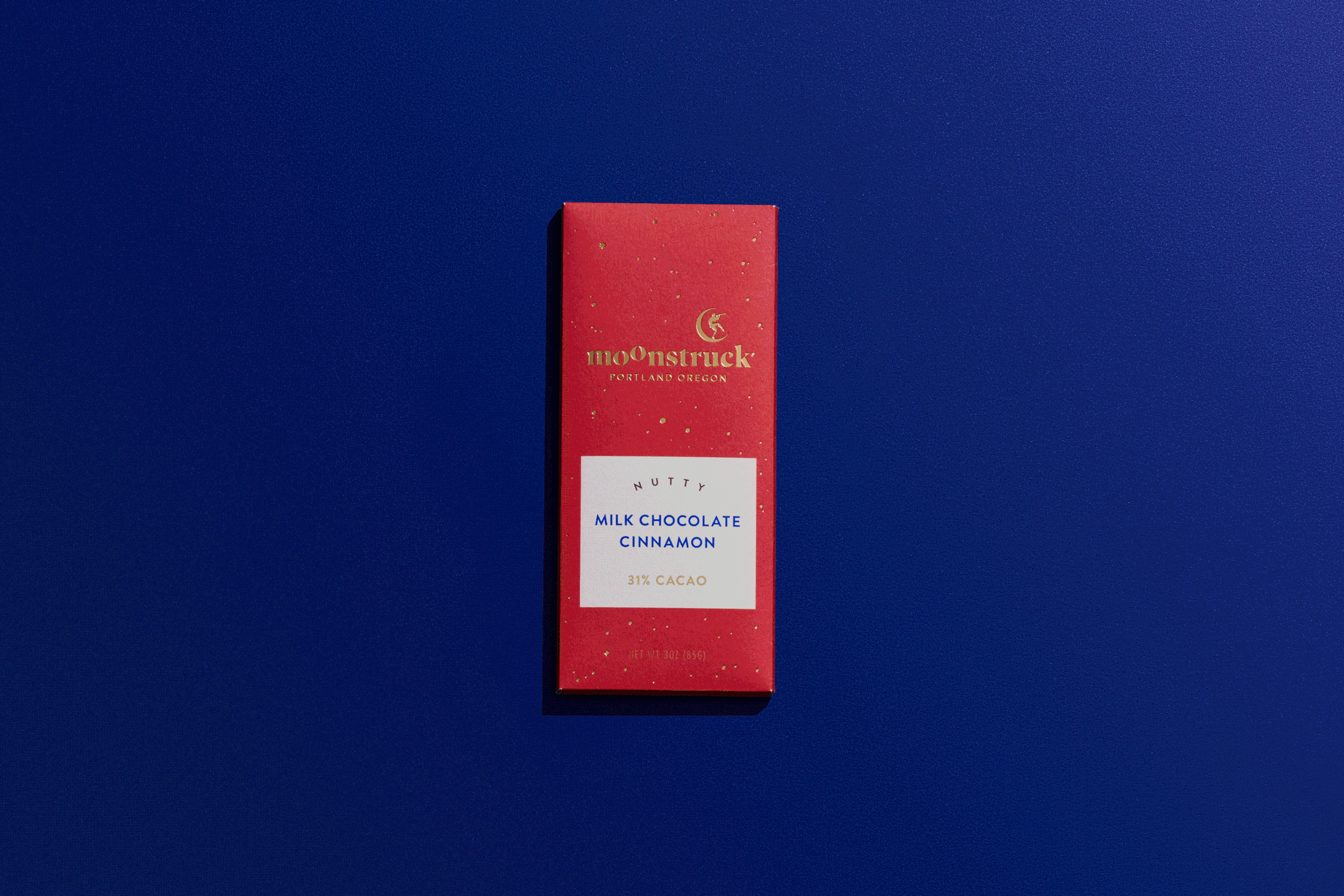
Moonstruck Chocolate Co. came to Sockeye seeking a packaging redesign of their classic bar offerings, while looking to expand distribution nationally. Once a leader and innovator (started in 1993), the brand was overpowered by a category that wildly expanded through competition, product innovation, bold flavors, flashy packaging and more. Our National consumer research revealed an important insight: the magic of chocolate disrupts the monotony of adulthood. In a category where more is more, we strengthened Moonstruck’s position by leaning into something only they possessed… a name that is powerfully emotional as being “moonstuck” means to be dreamily romantic or bemused. As we celebrated the dreaminess of their name, we embraced the belief that chocolate is a gift you give yourself.


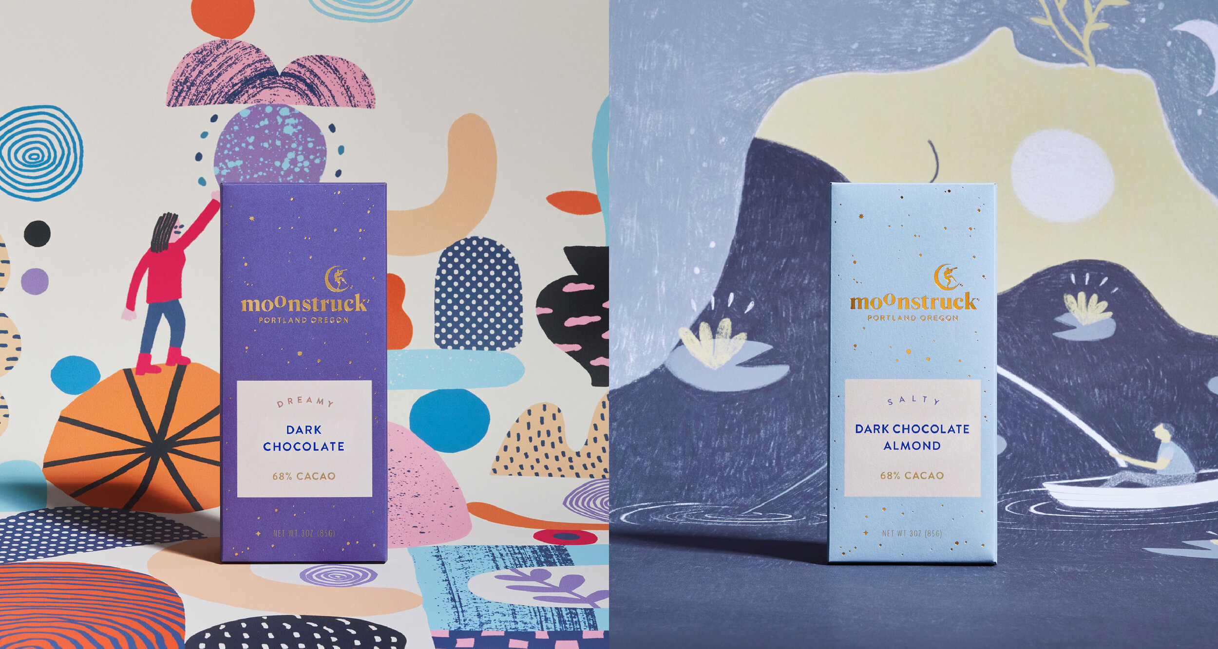


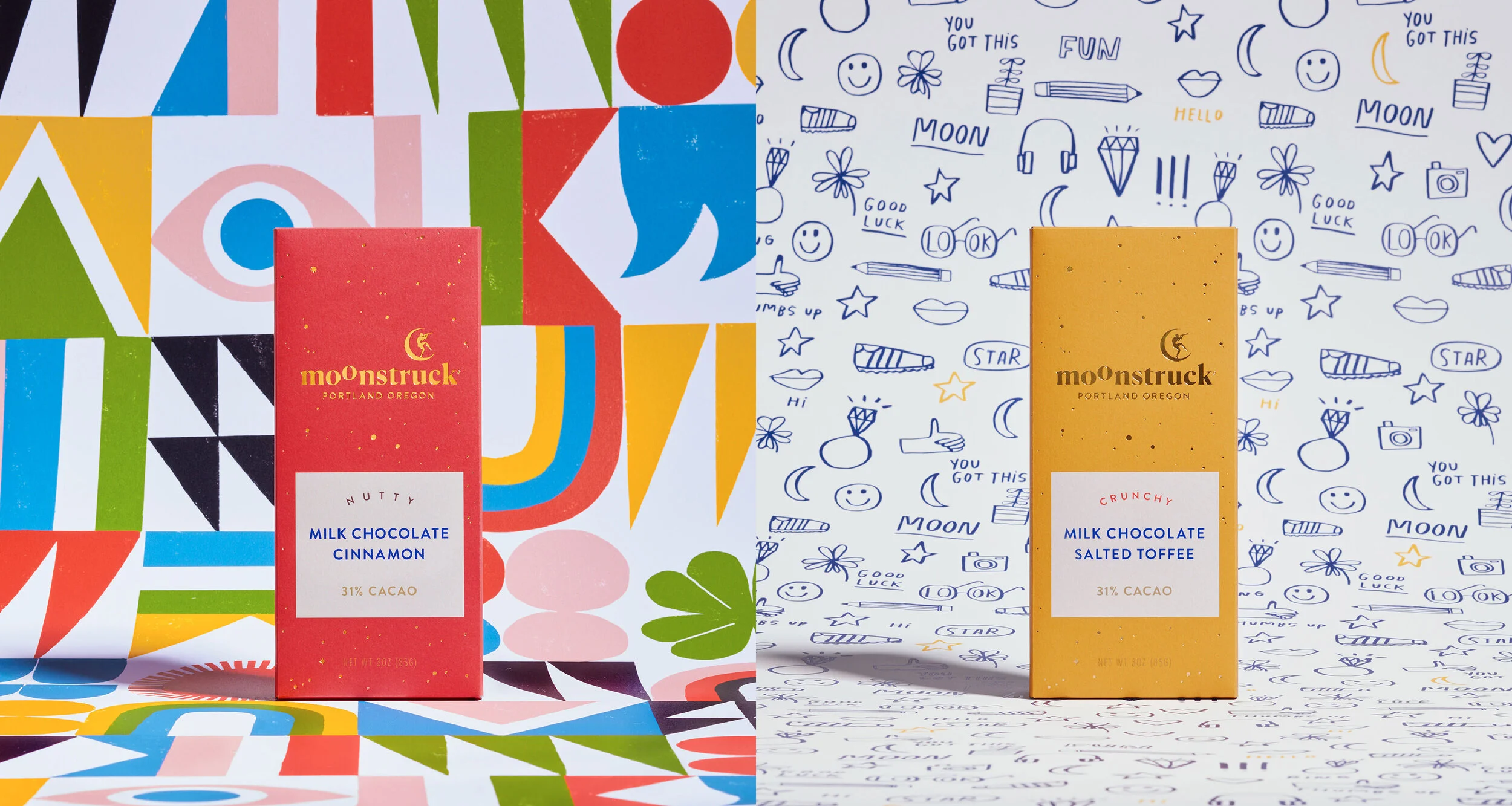

Working with local artists, the new identity and packaging celebrates the ritual that UNFOLDS from purchasing to unwrapping to the chocolate itself –
because where there is chocolate, there is magic.


Shout outs
My role included: Art and Creative Direction, design, and copywriting while at Sockeye.
Design and production collaboration with the ever-talented Maddie Black. Strategy and copywriting by Emily Smith. Yen Nguyen’s management skills make the world go round.
Special thanks to our illustrators: Lisa Congdon, Brett Stenson, Lan Truong,
Tess Rubenstein, Kate Bingaman-Burt, and Ryan Bubnis – y’all are magic!
Photoshoot Details
Photographer: Polara Studios
Stylist: Anne Parker
PIC: Maddie Black
Producer: Hari Khalsa
Bar & Background printing: Brown Printing